ANALYSES
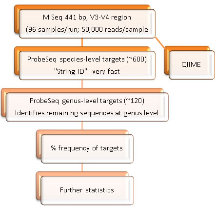
The original HOMINGS analysis targeted the V3-V4 region of the 16S rRNA genes (newer analyses now target the V1-V3 regions). An average of >50,000 sequences of about 441 bp per sequence were typically obtained in a MiSeq run of about 90 samples. Bad or low (<5,000) reads were removed from analyses. Species-specific, 16S rRNA-based oligonucleotide "probes", many of which were originally designed for HOMIM, were used in a BLAST program (called ProbeSeq for HOMINGS) written by Sean Cotton to identify the frequency of oral bacterial targets. 538 oligonucleotide probes of 17 to 40 bases targeted individual oral bacterial species or, in some cases, a few closely-related species. In order to get nearly complete coverage, an additional panel of 129 genus-specific probes was used.
Outputs were expressed in excel spreadsheets as % frequencies (i.e., relative abundance) of target taxa (partial output shown below) and were converted to bar graphs (see figure below).
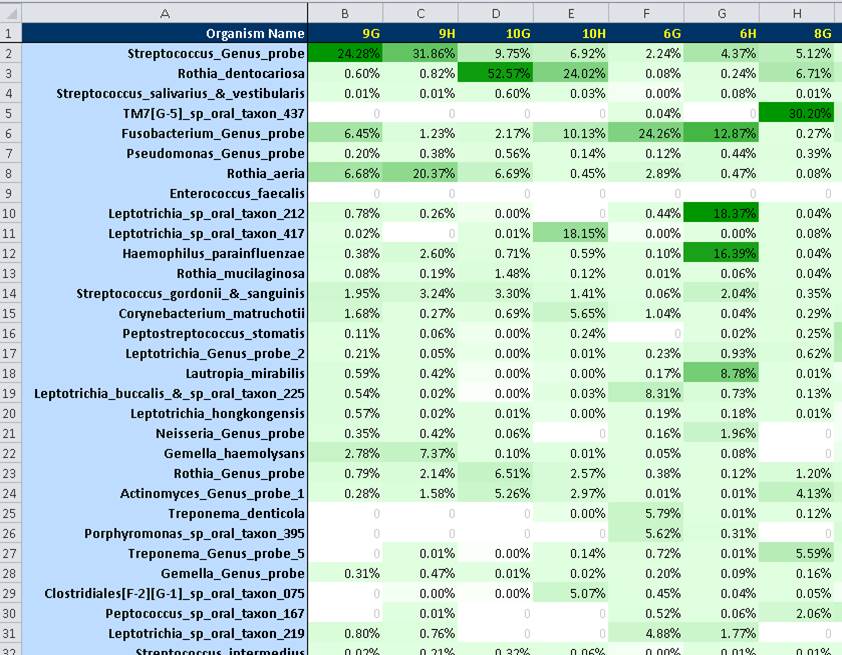
Partial output of ProbeSeq analysis. Relative levels are indicated by color gradients shown in green.
Charts of the % frequencies were also provided in the form of stacked bar columns (shown below). Sequence identity and % frequency for each bar is revealed using the mouse rollover.
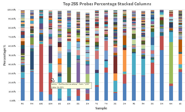
Stacked bar graphs of ProbeSeq analysis. Relative proportions and comparisons of bacterial taxa can be seen at a glance.
For final analyses, % frequency data could be incorporated in any number of statistical packages, such as the R project, MeV, SAS, and QIIME. In a simple example shown below, 16S rRNA profiling data from clinical samples compared 5 periodontally healthy subjects with 5 periodontitis. Data were incorporated into QIIME to produce bubble graphs (PCA plots). These graphs differentiated the healthy profiles from the disease profiles. In addition, the relative abundance of specific species can be indicated by the size of the spot.
![]()